<div class="wrap">
<div></div>
<div></div>
<div></div>
<div></div>
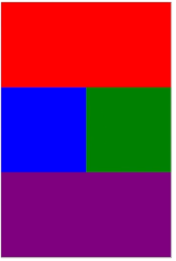
</div>2번째 파랑색 div 블럭과 3번째 초록색 div 블럭을 어떻게 한 라인에 배치를 할 수 있을까?
크게 4가지 방법을 통해 알아보겠다.
1. 많이 사용하지 않은 귀찮은 방법
<div class="container">
  <div class="top"></div>
  <div class="left"></div>
  <div class="right"></div>
  <div class="botoom"></div>
</div>
.container {
width: 400px;
height: 600px;
border: 1px solid black;
}
.top {
background: red;
width: 400px;
height: 200px;
}
.left {
background: blue;
width: 200px;
height: 200px;
}
.right {
background: green;
width: 200px;
height: 200px;
}
.bottom {
background: purple;
width: 400px;
height: 200px;
}
결과를 보면 left와 right는 한 block에 공존하지 않고, bottom은 container의 크기를 넘어서 밑으로 내려가있다.
살구색으로 표시된 여백만큼 공간이 충분히 있음에도 right가 밑으로 내려가는 이유는 left의 값에 display : block 이라는 기본 값이 설정되어 있기 때문이다. 그래서 display를 inline-block으로 설정해줘야 한다.
.left {
  background: red;
  width: 400px;
  height: 200px;
  display: inline-block;
}

.right {
  background: blue;
  width: 200px;
  height: 200px;
  display: inline-block;
}
그럼에도 html상에서 div 태그끼리 엔터키를 쳐서 코딩했기에 여백이 포함되어 있다. 그래서 (200px + 200px + 여백 한 번)으로 공간이 모자라서 밑으로 가게된다. 그래서 font-size를 0으로 설정한다. font-size 같은 경우는 상속이 되는 속성이기 때문에 container에서도 가능하다.
.container {
  width: 400px;
  height: 600px;
  border: 1px solid black;
  font-size: 0px;
}
left와 right의 경우, display가 inlne으로 맞춰져 있기 때문에 한 쪽에만 글이 있는 경우, 의도한 디자인이 안나온다. 그래서 수직정렬을 부여해준다.

.left {
  background: red;
  width: 400px;
  height: 200px;
  display: inline-block;
  vertical-align: top;
}
이러한 방식으로 레이아웃을 만드는 게, 가장 구시대적이고 귀찮은 방법이다.
'Mark Up > CSS' 카테고리의 다른 글
| [CSS] Chapter 11. 레이아웃 만들기 - grid (0) | 2022.12.29 |
|---|---|
| [CSS] Chapter 10. 레이아웃 만들기 - float (0) | 2022.12.29 |
| [CSS] Chapter 08. CSS 레이아웃 (0) | 2022.12.26 |
| [CSS] Chapter 07. 시멘틱 태그와 스타일링 (0) | 2022.12.26 |
| [CSS] Chapter 06. class와 id 속성 (0) | 2022.12.23 |


댓글